As a business using 10to8 the first time, you can get started in minutes. This is because when you...
Your Brand New 10to8 – Q1 Product Updates 2022
Here at 10to8, we’re constantly working hard to innovate and improve, and this time, we’re combining a number of important changes. We’re super excited to share the improvements we’ve made to make your online scheduling tool even quicker and easier to use. We are launching a range of new features and benefits, new functionality, enhanced customer support, and a fresh new look for 10to8. We can’t wait for you to check it out!
10to8 has helped millions of people over the years make appointments happen, reducing no-shows, streamlining administrative work, and giving businesses that much-needed support. More and more companies are realizing the benefits of booking their appointments online.
Making 10to8 better
We’re always working to improve your user experience and have made a number of changes designed to keep 10to8 current, up to date, and even more easy to use.
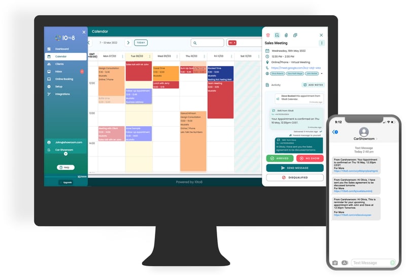
There are several improvements to assist you in navigating the product, from finding settings and pages that you need to a refresh of the interface. This is an exciting time for all of us here as we continue to work on making your experience with our product better and better.
We’re rolling these changes out across our platform from early March, through to the 22nd. The old styling will be removed in the weeks following the big launch.
Benefits to your business
The new product update has a lot of great new features and benefits but, most importantly, it’s designed to make your life as a business owner or manager much easier.
By making it simple for you to keep on top of your bookings, by giving you more control over your staff’s schedules, and by bringing all the features you need most right to the forefront, we hope that these improvements will make running your business a breeze.
Some of the main benefits for you are:
- Quicker navigation – with the new UI, you can get to where you need to be with fewer clicks
- Easier staff management – see multiple schedules at once and take bulk actions across your staff’s diaries
- A more polished look – a more professional feel to the product
- Smoother booking process – fewer errors and an overall more streamlined experience
And, of course, if there’s anything you’re not sure about, our new support integration is there to help you out.
What’s new?
So, what can you expect from the new product?
- Calendar changes,
- Integrations changes,
- Menu changes,
- And changes to the overall appearance of 10to8.
The new features pair with the new look and feel to give your appointment scheduling software its most powerful revamp to date.
Let’s dive into those new features in more detail:
New Integrations menu
Integrations are one of the most used features within 10to8. A lot of customers need to link their online booking page to other aspects of their business, such as their payment providers, calendars, or email software. To make this process easier, we’ve created an Integrations menu that allows you to quickly and easily connect to a host of different applications.
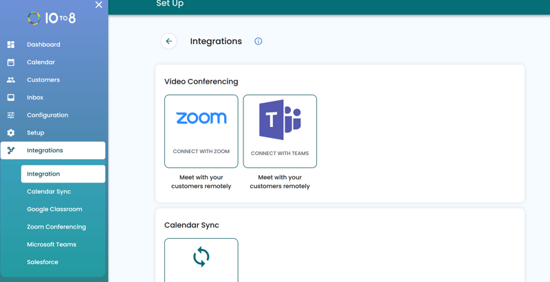
Integrations are now a stand-alone section connecting to popular services including video conferencing software, your calendar, online payment providers, Google Classroom, and other popular tools like WordPress and Facebook.
We’ve also created separate tabs within this menu drop-down for our most popular integrations. This includes:
- Salesforce
- Google Classroom
- Zoom Conferencing
- Microsoft Teams, and
- Calendar Sync
To set up an integration, you simply need to click on the menu, find the integration you want to set up, and follow the instructions. It’s quick and easy. steps. on the page.
Each of these tabs comes with step-by-step instructions that talk you through exactly how to link your account.
New Configuration menu
The configuration menu combines two of 10to8’s most used features – Online Booking and Messaging – into a single section. This makes it easier for you to find the settings that you need and makes the process of configuring your account much simpler.
The Online Booking section contains everything you need to customize your specific booking page. This includes the ability to design your booking process, booking buttons, and create widgets to add to your website.
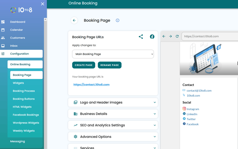
Under the Messaging you can customize both your customer and staff messaging. It also contains email settings, SMS settings, campaigns, and satisfaction surveys.
The Set-Up menu
The first place our customers usually visit when creating a new 10to8 account is the Set-Up menu. We’ve made a number of improvements to make it easier for you to find the settings that you need, and is split into eight sections:
- Business Details
- Services
- Staff
- Locations
- Availability,
- Taking Payments
- Phone Bookings
- GDPR and HIPAA
Within each of these sections are simple instructions supporting you to set up and configure that area of your 10to8 account.
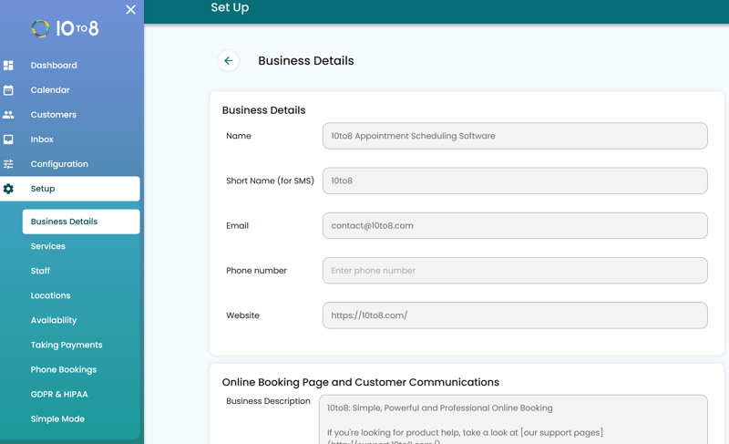
You still have the option to switch between ‘Simple’ and ‘Advanced‘ mode at the bottom of the menu. This means that staff members who don’t need features like GDPR and Phone Bookings don’t have to see them.
New calendar
Your online booking calendar has been updated and improved. It’s now more streamlined, easy to navigate, and easy on the eye.
Some of the functions you are used to having been moved:
- The ability to switch between the day and week view,
- The agenda and diary view,
- The switch to decide whether or not you show canceled as well as active appointments.
These are now under the icon in the top right corner of the calendar, as opposed to being on the options dropdown at the top.
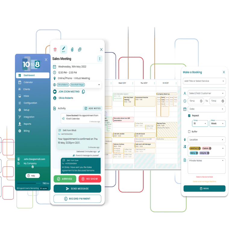
Secondly, our new calendar allows you to switch between weeks via the arrows. You can also click on the date box to reveal a popup calendar to easily navigate around the entire year. However, if you just want to know what’s going on today, simply hit the ‘Today’ button.
We’re quite excited about how you can now view the schedule of multiple staff members at once. Simply choose the names of the staff you want to see in the drop-down menu at the top of the page. This will make it much easier to coordinate staff members and help avoid double bookings between clients. You can also search by teams – for example, admin team, engineering team, etc – and select the ‘Me’ button to exclusively view your own calendar.
Finally, our new calendar also allows you to complete bulk actions. This makes canceling all bookings for a certain day a whole lot easier – which is super useful if you have a staff member who’s called in sick, for example.
Improved support material integration
It’s important we support you through these changes and whilst using your new 10to8.
Our support integration is available on the right-hand side. This allows you to easily read support articles whilst still interacting with the 10to8 product, and not a separate browser tab. There’s also a ‘How It Works’ section on most pages that allows you to easily find out more information about that section of the product.
Of course, you can still click the button at the top of the support window to open the article in a new tab if you want to. But this way, you can keep an eye on your appointments while you’re getting help.
New design
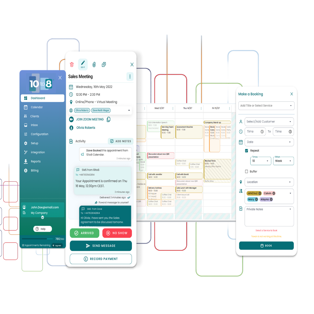
Last, but by no means least, let’s talk about the UI. Gone are the bright colors and sharp corners. Instead, we’ve introduced sleek lines, a modernized theme, a minimalist design, and an overall feeling of sophistication. The goal of the new UI was to be professional but also approachable. Trustworthy, but not stuffy. Enterprisy like Salesforce, but refreshing to use.
.jpg?width=800&name=Old-vs-New%20(1).jpg)
You’ll find an updated modern styling, a new color scheme, new fonts, a softer feel, more space, and a more intuitive design throughout the whole platform. We’ve also hidden some of the features you don’t use as often and brought our most sought-after features to the forefront of the tool, so you’ll be able to find what you’re looking for with minimal effort.
We’ve brought the look of our product up to date and given it a more professional feel. But, most importantly, we’ve ensured you have an easier time using the product. Everything is now just a few clicks away and the things you need are easy to find.
How did we create these changes?
Our Product & Design team created a number of prototypes that we shared with our beta testers and our online community for feedback. Following many iterations on design, the engineering team has been building the new system and gradually sharing it with more and more users, gathering more feedback and making improvements throughout.
Overall…
Our new release is packed full of new features and benefits. Whether you want to keep on top of your bookings, manage your staff’s schedules, or just want a more polished and professional scheduling system, these changes have something for you.
So, check it out! Explore your new 10to8! And we hope you enjoy these new changes! Also take a look at this video of our live product demo!
As always, if you have any questions or feedback, please don’t hesitate to reach out to our support team. We’re always happy to help!


Blog comments